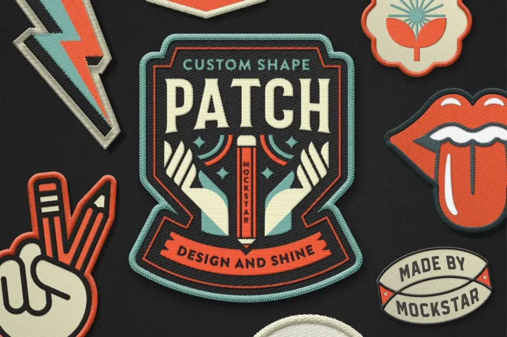
Patch Design is more than a simple badge sewn onto clothing; it’s a compact form of visual storytelling that signals identity and values. This guide covers patch design trends, patch color schemes, and patch layout tips to help you craft memorable patches. Whether for streetwear, schools, sports teams, or hobby projects, strong patch design elevates products beyond decoration and helps tell the brand story. By combining current trends with solid color theory and practical layout guidance, you’ll create patches that stand out and read well on fabric. If you’re ready to start, you’ll find actionable ideas in this overview for creators, makers, and brands.
Beyond the initial concept, designers speak of badge aesthetics, embroidered patch design, and emblem creation when shaping wearable patches. Think in terms of color palettes, texture, and layout geometry to ensure the patch works across garments and brands. Modern embroidery often blends 3D effects, sustainable materials, and modular shapes, all ideas that influence how your patch reads from a distance. For ideas, consider narrating a story through embroidered elements and using contrasting threads to highlight focal details. With thoughtful patch design ideas, brands can craft cohesive collections using consistent color schemes and layout principles.
Patch Design Trends: Current Movements Shaping Patches
Patch design trends are the compass that guides modern embroidery projects. Current directions emphasize bold outlines and clean silhouettes to improve readability from a distance, alongside retro motifs that tap into nostalgia and shared brand storytelling. 3D embroidery and textured elements, such as raised fills and padded borders, add tactile value that makes patches feel premium even at small scales. Irregular shapes and freeform cuts push personality beyond traditional badges, while sustainability and ethical storytelling align with growing consumer expectations. Finally, small‑batch and modular patches enable interchangeable pieces that let customers customize their looks. Together, these textures and directions form a cohesive language for contemporary patches.
To translate patch design trends into practical work, start with a critical inventory of patches you admire. Identify recurring motifs, shapes, or color decisions, then translate those patterns into a distinct signature for your brand. Trends should inform your concept without overpowering the core logo or message. The most successful patches balance readability, strong branding, and a cohesive product line, using trend-informed choices to reinforce a clear identity rather than complicate it.
Patch Color Schemes: Mastering Color Theory for Legibility and Brand Alignment
Color is the heartbeat of every patch, guiding attention and reinforcing identity. Patch color schemes rely on solid color theory: complementary pairs create high contrast, analogous palettes deliver harmony, and triadic schemes offer vibrant balance without visual overload. When choosing colors, prioritize clear foreground-to-background contrast so text and emblems stay legible at the smallest expected viewing distance. Limited palettes—typically 4–6 core colors—help production stay efficient while preserving impact.
Practical color work means keeping brand alignment at the forefront. Match patch hues to your brand’s color system and test palettes on swatches before committing to production. Consider where accents will fall—bright pops for focal points like letters or badges can guide the eye without complicating the embroidery. By pairing tested palettes with a thoughtful hierarchy, you ensure that color choices enhance both aesthetics and performance in real-world use.
Patch Design [Patch Design] Essentials: Layout Tips for Composition
Effective patch layout is a study in composition. Start with a strong focal point—whether a central emblem, mascot, or bold lettermark—that anchors the design and draws the viewer’s eye. Choose between symmetrical layouts for traditional insignias or asymmetrical arrangements for a modern, energetic feel. Clear typography is essential; select a readable typeface and ensure sizing works at the smallest viewing distance to maintain legibility.
Beyond the focal point, manage space with a clear visual hierarchy. Use negative space to prevent crowding and establish a consistent edge treatment and safe margins that survive production. Plan for multiple sizes and provide scalable vectors so the design remains legible across patches. Draft several thumbnail layouts to test balance, proportion, and readability before finalizing the composition.
Embroidered Patch Design Techniques: Stitch Density, Texture, and Production Realities
Embroidered patch design hinges on practical stitching decisions. A true vector-driven workflow should feed into a thread-mable color map, translating art into embroidery-friendly zones. Matching density with stitch types—satin stitches for outlines, fill stitches for solid areas, and underlay to stabilize fabric—helps prevent puckering and preserves clean edges. Texture elements like satin borders or padded regions add perceived value without sacrificing durability in everyday use.
Production realities shape every design decision. The choice of backing (iron-on, Velcro, or sew-on) and the fabric type (denim, twill, knit, or canvas) determine stitch density and backing compatibility. Prototyping is essential: a physical sample reveals color rendering, stitch tension, and overall finish that digital previews can’t fully capture. Keep production files organized with color maps and backups for post‑digitizing tweaks to ensure a smooth handoff to manufacturers.
Patch Design Ideas: Fresh Concepts for Small-Batch and Modular Patches
Patch design ideas thrive when they blend signature branding with flexible formats. Concepts like modular patches—interchangeable pieces that buyers can mix and match—offer versatility for limited runs and seasonal drops. Irregular shapes and freeform silhouettes can emphasize brand personality, while sustainable materials and eco-friendly narratives create meaningful storytelling. Case studies show how a cohesive color palette, legible typography, and a strong central motif can unify diverse elements into a compelling patch family.
To turn ideas into production, start from your brand identity and sketch a few concept directions. Translate those sketches into scalable vector art, then map colors to embroidery threads and prepare stitch count sheets. Consider providing multiple size options to maintain a consistent look across scales, and document the rationale behind color choices and layout decisions to streamline approvals with partners or clients. With iterative testing and careful planning, patch design ideas become tangible products that resonate with audiences and perform reliably in production.
Frequently Asked Questions
What is Patch Design and how do patch design trends shape effective branding?
Patch Design is the craft of creating wearable patches that tell a story and reinforce branding. Patch design trends influence outlines, shapes, textures, and motifs, but readability and logo clarity come first. Start with a strong concept and apply trends—bold outlines, 3D embroidery, and irregular shapes—while keeping the central emblem as the focal point.
How do patch color schemes influence Patch Design and brand consistency?
Patch color schemes use color theory to guide contrast, mood, and legibility. Use complementary or analogous palettes and limit to 4–6 thread colors for production efficiency. Align hues with your brand system to keep patches cohesive and ensure foreground colors pop against the background.
What patch layout tips are essential for Patch Design across sizes and products?
Patch layout tips center on a strong focal point, clear typography, and proper margins. Plan for multiple sizes, draft thumbnail layouts, and test legibility at small scales. Choose an edge shape and ensure visual hierarchy guides the eye from the main emblem to supporting details.
How does embroidered patch design impact texture, durability, and premium feel in Patch Design?
Embroidered patch design uses stitch types and density to create texture and durability. Use satin stitches for outlines, fill stitches for fills, and underlay to stabilize fabric. Select backing and edge treatment that fit the product, wash care, and usage expectations.
Can you share patch design ideas that balance aesthetics with production realities in Patch Design?
Patch design ideas include modular patches, irregular shapes, and sustainability-themed motifs. Use a limited palette with earthy or bold hues, and prototype with swatches to verify color rendering and stitch quality before production.
| Topic | Key Points | Practical Takeaways |
|---|---|---|
| Trends in Patch Design |
|
|
| Color Schemes for Patches |
|
|
| Layout Tips for Patch Design |
|
|
| Tools, Techniques, and Production Realities |
|
|
| Case Studies and Practical Examples |
|
|
| Best Practices for Patch Design |
|
|
Summary
Conclusion: Patch design is a nuanced craft that blends storytelling with production practicality. By following patch design trends, crafting thoughtful color schemes, and applying disciplined layout tips, designers can create patches that are visually compelling, durable in production, and resonant with audiences. Embrace a practical workflow—from vector artwork and color-mapped threads to backing choices and prototypes—and you can build patches that elevate brands, spark community engagement, and endure across products and collections. Patch Design invites experimentation within a framework of readability, durability, and scalability, turning patches into powerful storytelling accessories for your line.