
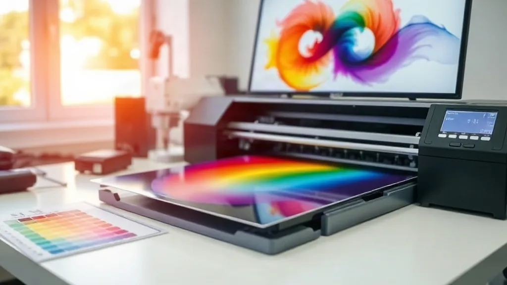
You've dialed in your press settings, your powder application is flawless, and your film is perfectly cured. Yet somehow, the finished dtf transfers look nothing like the vibrant design on your screen. If this sounds familiar, you're not alone. Color inconsistency is one of the most frustrating and least discussed challenges in DTF printing. It's not about mechanical failure; it's about color management, a discipline that separates hobbyists from professionals. Mastering it is the key to producing dtf prints that consistently meet client expectations and build your reputation.
Why Color Management Matters for DTF Transfers
Color management is the process of controlling how colors are represented across different devices: your monitor, your printer, and the final garment. Without it, every device interprets color differently, leading to disappointing results. For dtf transfers, this means a design that looks bright red on your screen might print as a dull maroon, or a subtle gradient might turn into a harsh band. The stakes are high because DTF is often used for complex, full-color artwork where accuracy is crucial.
Investing time in color management pays off. It reduces waste from misprints, speeds up your workflow by eliminating guesswork, and most importantly, builds trust with customers who return because they know your prints match their vision. When someone searches for dtf transfers near me, they're looking for a reliable partner who can deliver consistent quality. Color management is how you become that partner.
The Core Components of a Color-Managed Workflow
A color-managed workflow involves three main pillars: calibrating your monitor, profiling your printer, and using the right software settings. Each plays a vital role in ensuring the colors you see are the colors you print.
1. Monitor Calibration: The Starting Point
Your monitor is your window into the design. If it's not calibrated, you're editing colors based on a false representation. A calibrated monitor ensures that the red you see is the actual red value in your file, not an exaggerated or muted version. Use a hardware calibrator like a Datacolor Spyder or X-Rite ColorMunki to create a custom profile for your display. Calibrate regularly, especially if your monitor is in a room with changing lighting conditions. Avoid editing in direct sunlight or with colorful walls that can cast a hue on your screen.
2. Printer ICC Profiles: The Translation Layer
ICC profiles are files that tell your printer how to reproduce colors accurately on a specific substrate. For DTF, you need a profile tailored to your printer, ink, and film combination. Most printer manufacturers provide generic profiles, but for true accuracy, consider creating custom profiles with a spectrophotometer. A custom profile accounts for the unique characteristics of your equipment, ensuring that your dtf prints match your design intent. If custom profiling isn't feasible, at least ensure you're using the correct generic profile for your film type (e.g., matte vs. glossy).
3. RIP Software: The Control Center
Raster Image Processor (RIP) software is where you manage color settings before printing. It allows you to select the correct ICC profile, adjust ink limits, and control halftoning. Popular RIPs like AcroRIP, PrintExp, or Flexi offer robust color management tools. In your RIP, always embed the ICC profile and choose the rendering intent that suits your design: perceptual for photos, relative colorimetric for logos with specific brand colors. Experiment with these settings on small test prints to see how they affect the final output.
Practical Steps to Achieve Consistent Color
Implementing color management doesn't have to be overwhelming. Follow these steps to build a reliable workflow.
- Start with a test file: Create a test print with a color chart (like the IT8 target) and common colors (skin tones, brand logos). Print it on your DTF film and press it onto a white shirt. Compare the result to the original file on your calibrated monitor. This reveals any discrepancies.
- Adjust ink limits: In your RIP, set ink limits to prevent over-inking, which can cause bleeding and dull colors. Start with the manufacturer's recommendation and adjust based on your test prints.
- Use the right film: Different films have different coatings that affect ink absorption and color vibrancy. Stick to one high-quality film and profile for it. Changing films often requires new profiles.
- Control your environment: Humidity and temperature can affect ink drying and color output. Maintain a stable environment, ideally around 20-25°C and 40-60% humidity.
- Document your settings: Keep a log of your ICC profiles, RIP settings, and press parameters for each fabric type. This saves time when repeating jobs and ensures consistency.
Matching Colors to Different Fabrics
DTF transfers can be applied to a wide range of fabrics, but each fabric interacts with ink differently. Cotton, polyester, and blends absorb ink and reflect color in unique ways. For example, colors tend to appear more vibrant on 100% cotton, while polyester can make them look slightly muted or even cause dye migration. To manage this, create separate ICC profiles for each fabric type you commonly use. When printing for a specific garment, select the corresponding profile in your RIP. Also, consider the fabric's color: printing on dark colors requires a white underbase, which you must account for in your color separations. Always do a test press on the actual fabric to confirm the final appearance.
Common Color Issues and How to Fix Them
Even with a managed workflow, problems can arise. Here's how to troubleshoot the most common color issues.
- Prints look dull or washed out: This often indicates insufficient ink or incorrect ICC profile. Check your ink levels, ensure you're using the right profile, and try increasing ink limits slightly. Also, verify that your film is not expired and stored properly.
- Colors are too dark or saturated: This could be due to over-inking or a wrong profile. Reduce ink limits and double-check that the profile matches your film and printer. Sometimes, the rendering intent in your RIP might be set to perceptual when relative colorimetric would be better.
- Inconsistent color between prints: This points to environmental factors or inconsistent powder application. Ensure your studio conditions are stable and that you're applying powder evenly. Also, check that your printer's print head is clean and nozzles are firing correctly.
- Color fading after washing: While this is often a wash durability issue, it can also be related to under-curing. Ensure your powder is fully melted and your press settings are correct. Using a quality powder and following the manufacturer's cure schedule is essential.
Frequently Asked Questions
How often should I calibrate my monitor for DTF printing?
For professional results, calibrate your monitor every 2-4 weeks, or whenever you notice a shift in color. If you're in a production environment, weekly calibration is recommended. Also recalibrate after major software updates or if you move your monitor.
Can I use the same ICC profile for all fabrics?
No, different fabrics require different profiles because they absorb and reflect ink differently. Using a single profile across fabrics will lead to inconsistent colors. Create separate profiles for each fabric type you use regularly.
What is the best rendering intent for DTF transfers?
For most designs, relative colorimetric with black point compensation is a good starting point, as it preserves brand colors accurately. For photographic images with out-of-gamut colors, perceptual may yield more pleasing results. Test both on your typical artwork.
Why do my DTF prints look different on dark shirts?
Printing on dark shirts requires a white underbase, which can affect color vibrancy. The white layer reflects light back through the ink, but it can also cause colors to appear slightly muted. Ensure your design includes a white underbase and that your RIP settings account for it. Also, consider using a higher opacity white ink.
How can I ensure color consistency across different DTF printers?
If you operate multiple printers, create custom ICC profiles for each one and ensure they are regularly maintained. Use the same RIP software and settings across all devices, and standardize your ink and film brands. Regular test prints and cross-comparisons will help you catch any drift.